The political inspiration for the Paris 2024 Olympics design
There's more to the pastel-coloured look than meets the eye
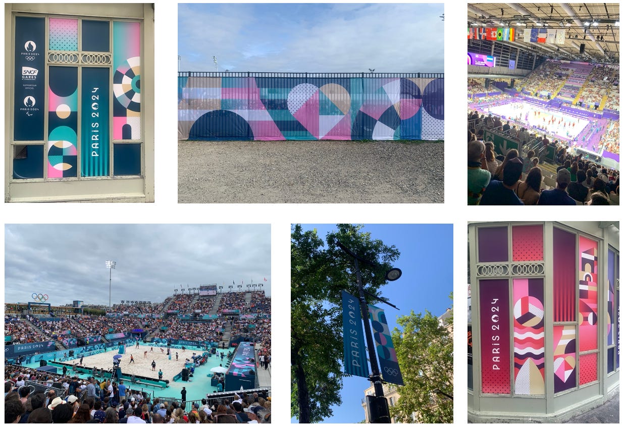
If you’ve been watching the Paris Olympic Games, you’ll have probably noticed the multi-coloured designs on display at all the events.
At first, the visual identity looks like a charming and inoffensive piece of graphic design. But wait. This is France and, as with many things, politics is never far away.
As brand director Julie Matikhine explained in an interview with Creative Review, there’s a revolutionary undertone to the Paris 2024 look.
“Our visual concept is based on a play on the words Sous les pavés, les Jeux,” she said. “The line is a take on Sous les pavés, la plage!, one of the many inspirational and provocative slogans seen during the Paris protests of May 1968.”
Sous les pavés, la plage literally means “under the paving stones, the beach”. It was a way of expressing the idea that by tearing away the concrete slabs of the city, a brighter future could emerge.
“These paving stones are the basis of our system,” explains Julie Matikhine. “A paving stone is a square and using this simple shape we can build lots of things. But what’s interesting is what we put in the paving stone shape.”
The paving stones form the grid of the design and then symbols with a strong French association are used to fill them, such as a heart or the Eiffel Tower.
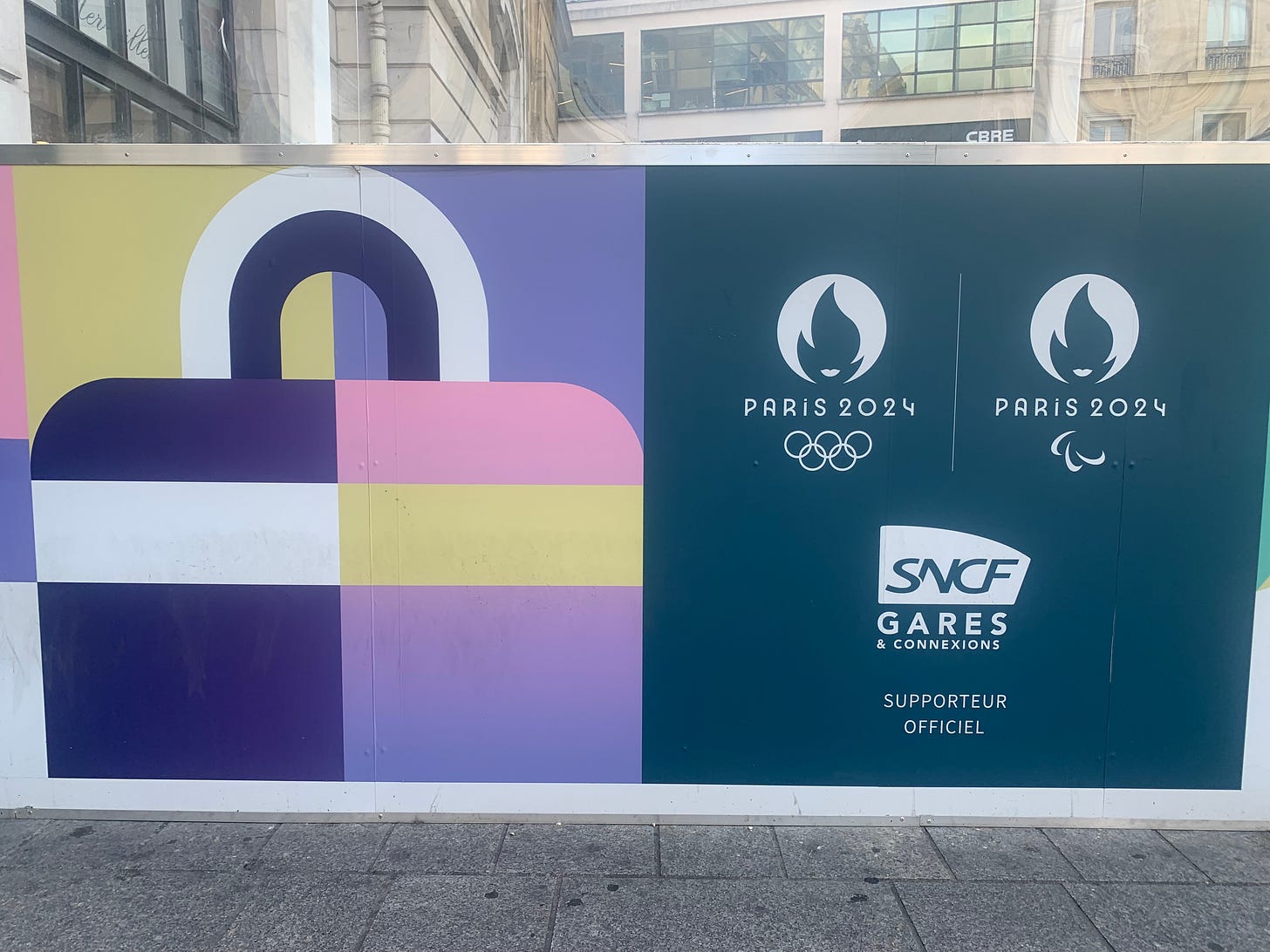
The design system works well across Paris and is tailored to suit each environment, such as this bag icon used at the Paris Saint Lazare train station, which is close to the big department stores Galéries Lafayette and Printemps.
The design was created by the Paris office of the Conran Design Group, the company founded in 1957 by Sir Terence Conran, and now owned by French advertising giant Havas. Conran was a British designer, restaurateur and writer who launched a revolution of his own, transforming British style sensibilities with the launch of Habitat in the 1960s. Sir Terence died in 2020 so is not around to see the work, but it’s fitting that a company he founded is involved given his love of France.
Having seen the work in situ I have to say it works beautifully. It’s distinctive and consistent while also blending well with the Paris cityscape. The same identity has been extended to other cities and towns hosting the Games across France such as Lille and Bordeaux.
On a side note, there’s one particular aspect of the design that has been a huge hit. The hats worn by the 45,000 volunteers at the Games, designed by French retailer Decathlon, are getting particular attention.
Known as a bob in French, the hat is exclusively for the volunteers so cannot be bought in the official Paris 2024 stores. As a result, some volunteers have decided to cash in on the hat’s popularity by reselling it on second-hand online sites, where prices have gone as high as €500.
Like the Games themselves, the Paris 2024 design and the stylish bob have been a huge hit.
Links
Conran Design Group Paris 2024 https://www.conrandesigngroup.com/more-work/paris-olympics-and-paralympics-2024/
Creative Review interview with Paris 2024 brand director https://www.creativereview.co.uk/paris-2024-olympics-identity-branding/
Fast Company interview with the Conran Design Group https://www.fastcompany.com/91158182/inside-the-tradition-bucking-branding-of-the-paris-2024-olympics
Olympic hats sell online https://www.lequipe.fr/Jo-2024-paris/Tous-sports/Actualites/Jusqu-a-500-et-8364-sur-les-plateformes-de-seconde-main-les-bobs-des-volontaires-des-jo-2024-se-revendent-a-prix-d-or/1489552


Très intéressant d’apprendre plus sur ce branding plutôt exceptionnel. Il a contribué au franc succès des Jeux Olympiques à Paris.
Fascinating piece! I hadn't realised there was so much more to the stylish branding